Updating Medium’s “Your Stories” Page
I’ve spent a few months on Medium now, and for the most part, I love the simple UI. As both a writer and developer, there’s a lot to love. The app is clean and fast, a must for any reader or writer that would spend time here. Writing is a breeze in the editor, and even in the updated UI, navigating through stories feels organic.
Unfortunately, there’s one part of Medium that drives me nuts: the “Your Stories” page.
In this article, I explain why it’s so frustrating, how it could be improved, and then provide an improved implementation. I’m learning Next.js, so I built the implementation in that as a learning experience.
Your Stories: your problem
If you’ve written anything on Medium, you’re familiar with this page.
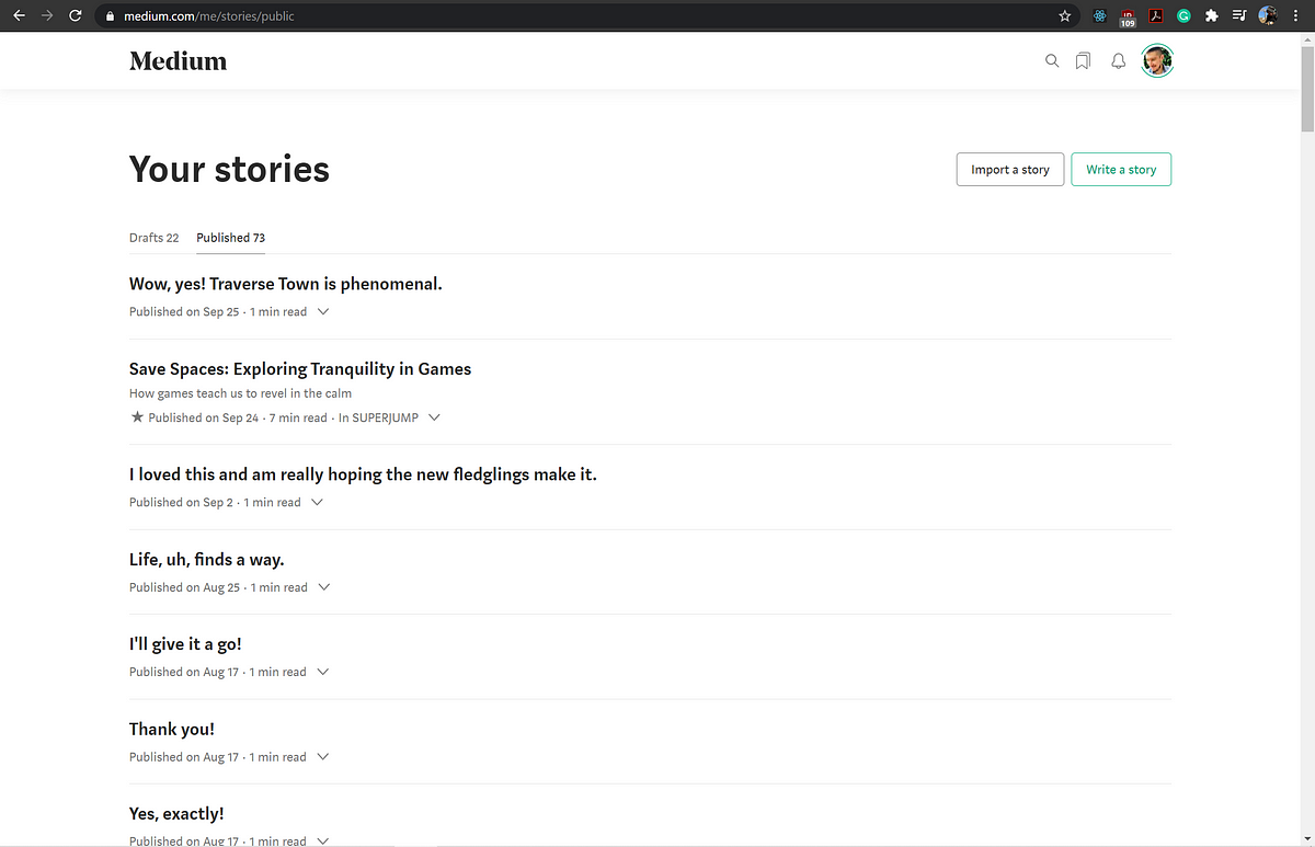 Source: medium.com/me/stories/public (my stories)
This is where all of a user’s stories are saved. We can separate this page into two main features: an archive for your stories (drats and published) and a button to create a new story. The latter isn’t this article’s concern and doesn’t do any more or less than it claims. The archive, however, leaves a lot to be desired.
Navigation
There are two tabs: Drafts and Published. Both tabs can contain stories or comments. The only difference is whether or not they’ve been published to the platform.
Clicking on either tab shows you a list of entries in chronological order. Published shows the most recently published entry, while Drafts shows the most recently edited.
The problem is there’s no sorting, filtering, search, or otherwise easy feature built into the platform to navigate through your content. At least once a week I have to scroll through my published stories trying to a story for some reason or another. Maybe I want to see that stories detailed stats, which can be done either by navigating to the story or by clicking this arrow and navigating to view stats.
 Source: medium.com/me/stories/public
Or maybe I write a ton of stories and simply need a link to an old story I wrote as a reference in a piece in progress. Either way, I have to scroll through a bunch of stories (or Ctrl-F) in order to find what I’m looking for. If I don’t remember the exact name of it, then I have no choice but to look through month by month until I find it.
Categorization
Another issue is that half of the entries in the archive are comments that I do not want to see. I understand that Medium wants users to be able to think of their comments as “stories” in their own right, and that’s all fine and dandy. But it adds to this cumbersome experience when trying to find something specific or view stories at a macro level.
In addition to this, there’s on way to look at stories by any filtering other than the default chronological. If I want to see posts only from this year, it’s not terrible, but what happens when I want to know everything I wrote last March? Get ready to scroll and Ctrl-F march.
In order to get around this, I’ve used the stats page or the archive in the Medium Partner Program page to find stories more quickly, as you only see ones that are able to generate revenue (non-story partner program comments). As an added bonus, you can look at earnings by month which helps narrow things down. However, this is only a soft workaround for a bigger problem.
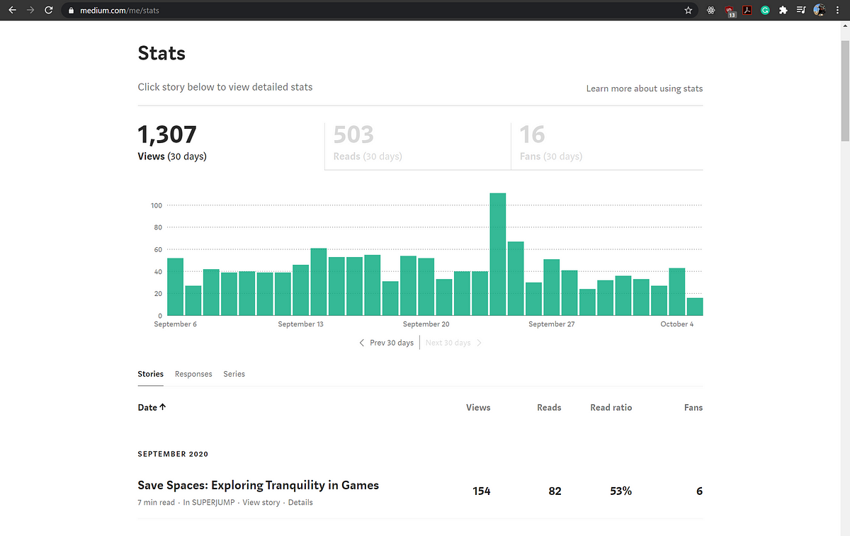 Medium Stats Page
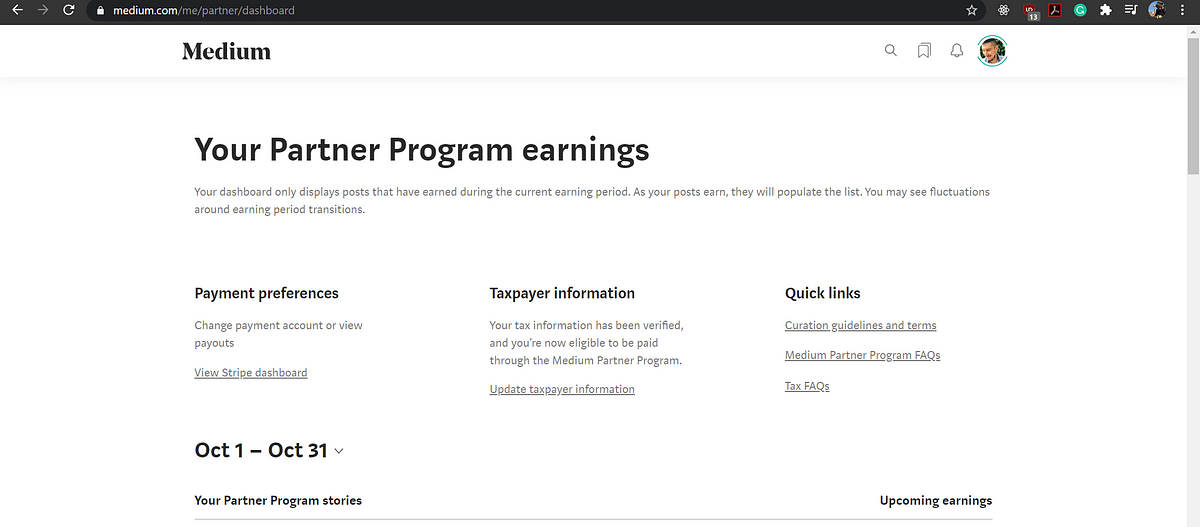 Source: Medium Partner Program page
What if I want to see my stories by publication? Length? Reads? What if I want to know which of my drafts are pending a publication review or are scheduled for publishing?
It would be immensely helpful to just have some basic search, filtering, and sorting functionality, let alone advanced options in order to easily cross-analyze stats.
The end goal should be to provide more flexibility for users in the stories page itself, as that’s where I as a user expect to view my stories.
Drafting a solution
Coming up with a good solution requires answering a simpler question first. What exactly is the purpose of the Stories page in the first place? I don’t work at Medium, so I can’t say what the original intent for the page was. Nonetheless, we can draw some conclusions from the rest of the Medium ecosystem.
The Medium Partner Program page is the place for viewing earnings for your stories, and it does its job — month to month earnings history for all of your partnered stories. Could it be more robust? Sure, but it doesn't need to be for the average user. Most people are just concerned with their month to month earnings. For yearly totals, we can look to Stripe or tax forms. The bottom line is this isn’t where I’d expect to go to view and search through my stories.
The stats page is the place for viewing stats. It gives you more options for sorting your stories than the Partner Program page, but its express goal is still viewing stats. Again, there are parts that could be improved, but this isn’t where I’d go to look for drafts, edit a story, etc.
From this, we can gather that the Stories page’s express concern isn’t stats nor earnings. Maybe it’s obvious at this point, but then that means it’s primary focus is viewing and navigating subsets of your stories, regardless of whether they’re comments, drafts, or published pieces.
To that end, the current page technically accomplishes this — it just does a bad job. Now that we’ve made our assumption about what it’s supposed to do, we can formalize the improvements as follows.
- Add search
- Improve filtering to go beyond simply “Drafts” and “Published”
- Add sorting
Redesign
The first thing I did was a couple of quick-and-dirty devtools mocks — nothing more complicated than changing static HTML and CSS. Honestly, even something as simple as being able to quickly filter stories, comments, and series would go a long way. For instance, below clicking on which ones you want to show.
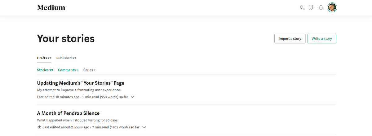
Another minimal fix would be to add a filter button to the right with advanced filtering options such as date, length, and so on.

As for sorting, there’s no need to get fancy. The stats page already implements a sortable table. We can borrow the theming from there. For sorting, we can use the theming for the medium-wide search function.

Implementation in Next.js
A quick peek under the hood shows, unsurprisingly, that Medium is using React. I’ve been learning Next.js, as I wanted to compare it to Gatsby (both are React frameworks). While this article won’t be focusing on that, I figure this is as good a project as any to practice on.
Bootstrapping with Markdown
First, let’s bootstrap a Next app with the skeleton for an app pulling data from Markdown files stored in a local _posts directory.
/_posts/...
While it might be better practice to build completely from scratch, this project’s concern is mostly with redesigning the Stories page, not making a fully functioning Medium clone. Because of that, all I need is a quick example skeleton of a basic blog. Luckily, Next.js provides a simple one I bootstrapped with npx.
npx create-next-app --example blog-starter medium-stories-example
This gives us a few things out of the box. First, it sets up the aforementioned posts directory with some markdown files of sample posts. It also gives us boilerplate for dynamic routes and slugs for those posts, as well as a landing page that implements those routes. Finally, it sets up Tailwind CSS for styling and boilerplate components that we will end up extending.
A little npm magic gets us a development environment up and running on localhost:3000.
 Tailwind is yelling at us, but we’re going to ignore that for now.
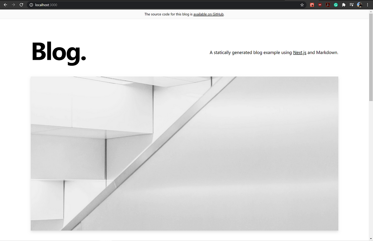 The Next blog out-of-the-box landing page. Lookin’ classy!
This accomplished a number of other things under the hood, like setting up authors, sample assets, and some components I won’t use. But again the important thing is it sets us up with fast dynamic routing for our posts.
Now I can create some dummy posts in markdown and Next.js will create the corresponding pages at build time. This will effectively mimic what Medium does for the purpose of this demonstration.
By default, the bootstrapper set up 3 example markdown posts in our _posts directory. It also sets us up with components, a lib for our app’s API, a directory for pages, public assets, stylings, and config files.
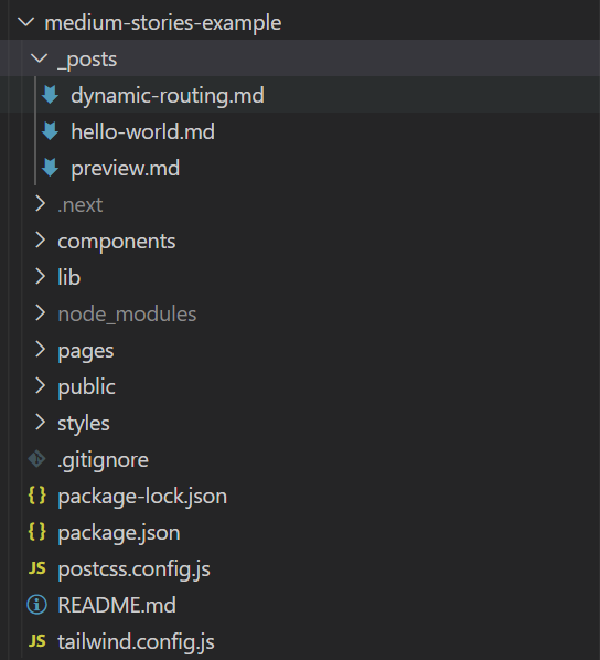
When I build, Next.js dynamically creates routes to those.
![Navigating to localhost:3000/posts/[filename.md] takes us to the corresponding page.](https://cdn-images-1.medium.com/max/1200/1*G8_uR4XB9f1bbcGoDKHaHQ.png) Navigating to localhost:3000/posts/[filename.md] takes us to the corresponding page.
Navigating to localhost:3000/posts/[filename.md] takes us to the corresponding page.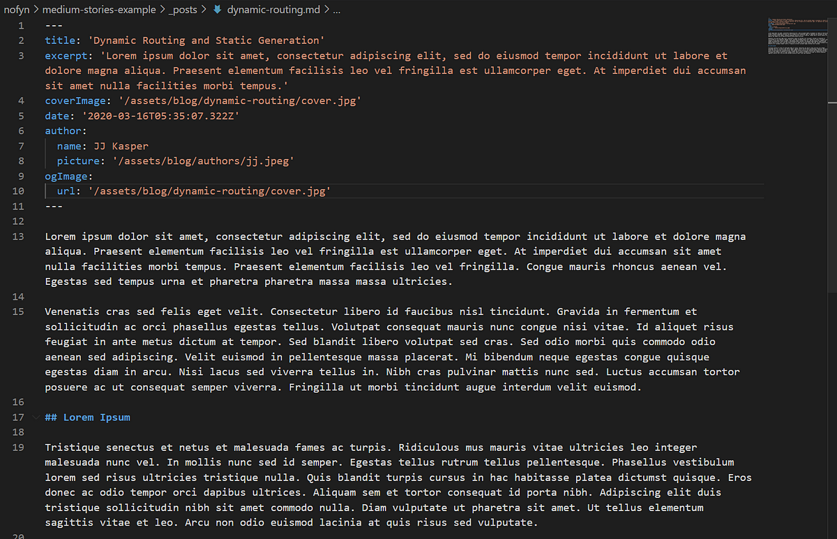 The markdown file that the route and page are generated from.
Cleaning Up the Boilerplate
Now that the bootstrap is there, let’s make it a little more Medium-like.
I don’t care as much about the landing and post pages, as they aren’t the focus of this project, but I’ll give them a quick makeover. The out-of-the-box page uses 5 main components: a header (they call it alert), intro, hero-post, more posts, and footer. These are all contained in a layout component. I’ll remove all of these except the intro and the footer and turn the page into more of an informative-style landing page. I’ll also create a custom about component used for displaying our info.
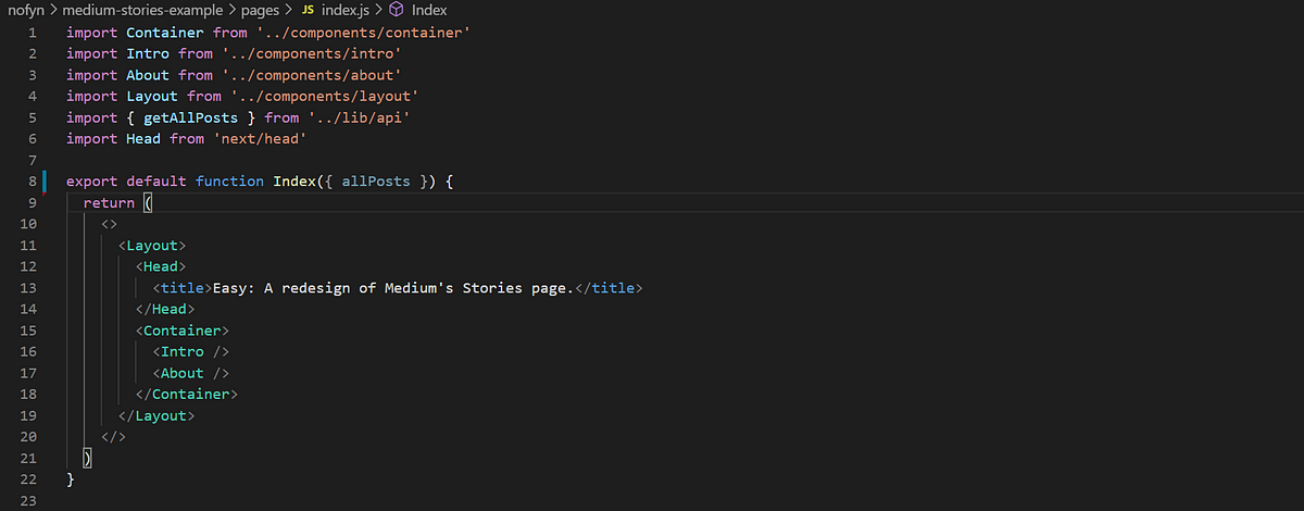 The reworked index.js
After minor tweaks to the components to get the text we want and styling to mimic Medium at a glance, we have a simple landing page.
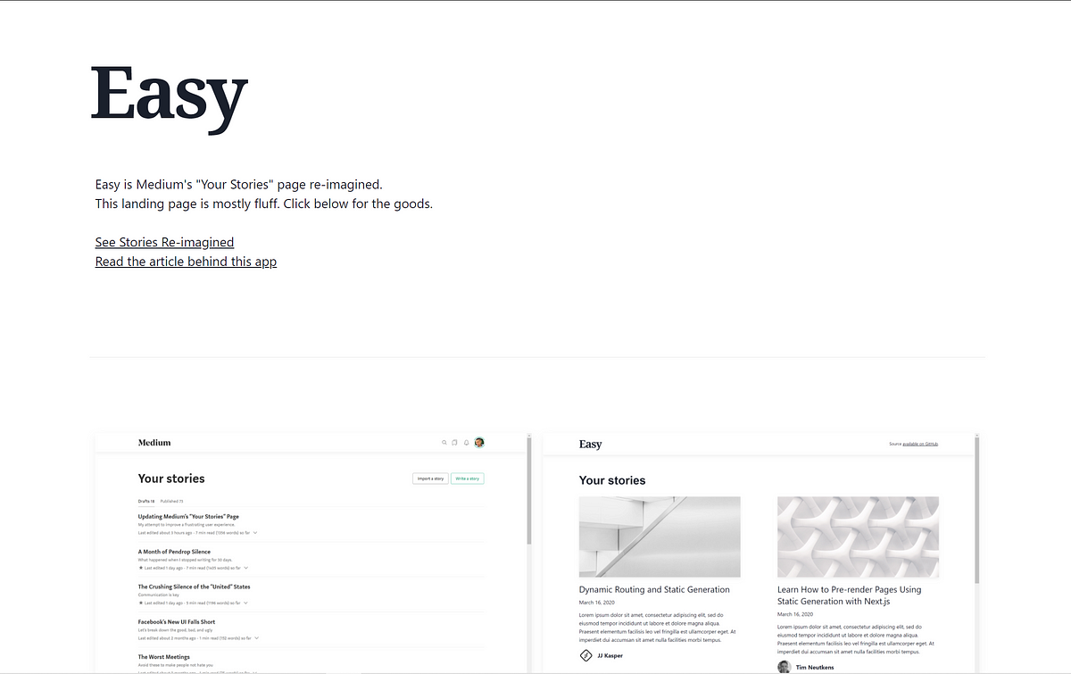 Landing page not including a simple footer
Medium’s fonts aren’t available for free, so I used Noto Serif for the logo, Roboto for headings, and the default Tailwind serif and sans-serif for copy. I eyeballed element padding, margins, etc. It doesn’t need to be a perfect clone to get the idea across, after all.
Notice the second section which displays side-by-side images for Medium’s page and the implementation, each of which links to its corresponding page. At this point, our implementation isn’t complete yet, so the image of our implementation is just a quick mock. We’ll revisit this later.
Now that the config and basic stuff is out of the way, let’s move on to the star of the show.
Mimicking the Stories page
Under pages, we’ll create stories.js, which will form the backbone for our page. For starters, we will only set it up to do what Medium already lets us do: display drafts and published posts. Then, we’ll extend it in the next section.
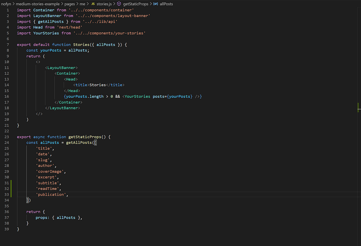
There are two main pieces for now:
export default function Stories({ allPosts }) { ... }
and
export async function getStaticProps() { ... }
Our default export sets up the layout for the page using some components we haven’t gone over yet.
On top of that, we use an async function, getStaticProps, which calls the API to retrieve all of the posts from the markdown files in our posts directory. We’ll then render these posts using a custom YourStories component.
Great, let’s fill in the gaps.
Medium’s “Your Stories” layout is a little different than the one on their landing page. Notice the toolbar across the top.

I’ll create a separate LayoutBanner component with a Banner component to mimic that.

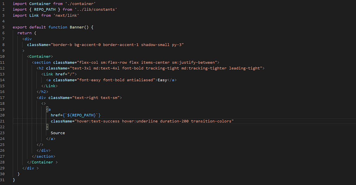
Now that those are good to go, we’ll need a component that renders the stories. For this, I’ll create YourStories, which will mimic the Next.js out-of-the-box MoreStories. The difference is I’ll have it grab a few additional fields from our markdown files, like read time, subtitle, and publication. We’ll add these to our markdown files as well.
Note that for demonstration sake we’re just using a static value for read time, as opposed to calculating the actual read time of the article. Similarly, subtitle and publication will be hardcoded as opposed to fetched, since we aren’t building in those parts of Medium.
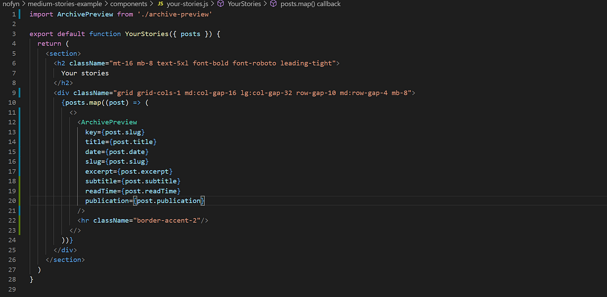
We import ArchivePreview, which is our version of PostPreview. Our version grabs what we need to display, as opposed to images, authors, etc.
With their powers combined, some touch-ups to styling, and edits to our Markdown files to include the new fields, we’re most of the way there.
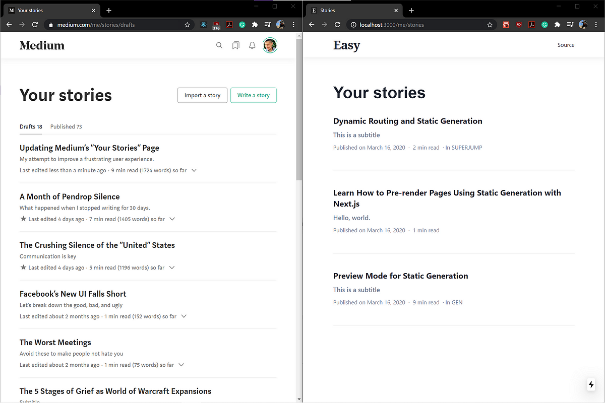
The only thing missing is drafts versus published posts. Thus far in the project we’ve taken a straightforward approach to categorizing posts — basically, a post can be anything in the _posts directory. We don’t draw distinctions between drafts and published posts, nor do we differentiate increasingly granular qualities like partnered, comments, etc. To keep this project simple, we’ll create another directory for drafts. If we were using Contenful or another CMS for handling content, we could instead use Next.js’s Preview Mode to work with drafts, but that’s outside the scope of this.
Now that the directory is there, we’ll need some drafts. We’ll use a tool called mediumexporter to grab some articles from Medium to populate drafts.
npm install -g mediumexporter
mediumexporter https//medium.com/[DRAFT LINK] > _drafts/[TITLE].md
We’ll do this for both drafts and some published posts to get some actual content (all content taken from my own Medium profile).